REGION Magazine
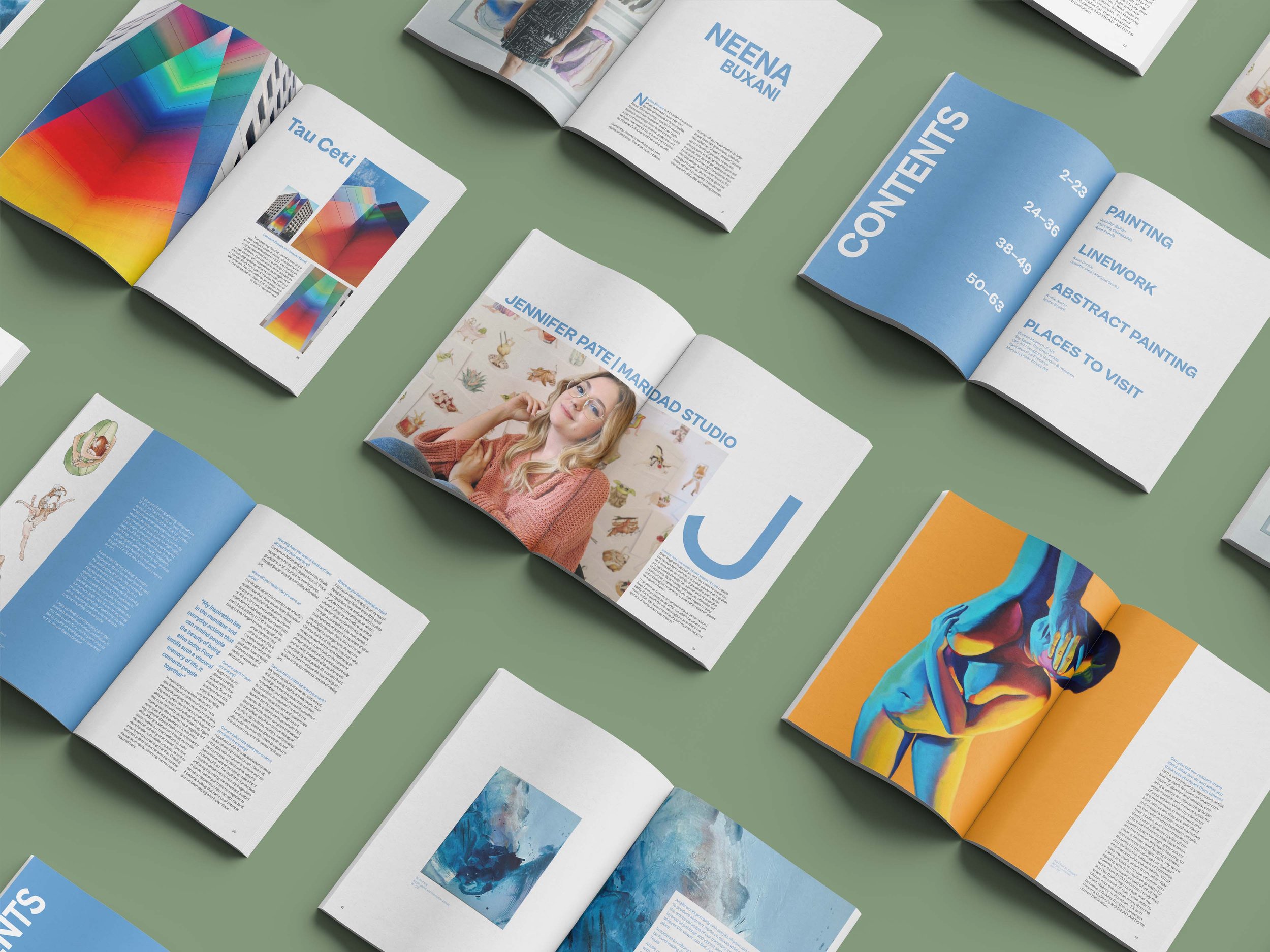
REGION Magazine is a magazine to highlight local artists in Austin, Texas. Although this magazine only uses one colour to accent, this magazine is bold. I was very intentional with each element and detail.
The use of large, oversized drop caps is very evident throughout the entire issue. This works as an indicator of each new article as well as a visual icon for readers to see and associate with the magazine. Full-page images are used to draw attention to certain articles.
I only used one colour as the magazine’s branding so that no matter what artwork is displayed on each page, there is an overall consistency to each issue.
Target Audience
Men & women, ages 18-35, who live in Austin, TX
Brand Words
Clean | Bold | Artistic


